Color Accuracy in Fashion Product Photos and Its Impact on Returns

Color accuracy is one of the most underestimated factors in fashion ecommerce performance. Many brands treat color as a creative or aesthetic choice. In reality, color accuracy is a trust and expectation issue that directly affects return rates.
A significant share of fashion returns are not caused by poor quality or fit, but by products looking different in person than they appeared online. Color is often the first and most obvious mismatch shoppers notice.
Why Color Is a High-Risk Variable in Fashion Ecommerce
Color is one of the few product attributes shoppers believe they can evaluate visually. When that belief is violated, disappointment is immediate.
Unlike fit or fabric feel, color mismatch is binary:
- It either matches expectations or it does not
- There is little room for interpretation or adjustment
This makes color inaccuracy disproportionately damaging to trust.
How Shoppers Interpret Color Differences
Shoppers do not think in technical terms like white balance or color profiles. They think in outcomes.
When color is inaccurate, shoppers assume:
- The brand misrepresented the product
- Quality control is weak
- Future purchases will be unreliable
Even small deviations can trigger these reactions. A “slightly warmer” tone online can feel like a completely different product in hand.
The Most Common Causes of Color Inaccuracy
Color problems rarely come from a single mistake. They usually result from compounded decisions across the image workflow.
Lighting Choices That Alter Hue
Strong directional lighting, mixed light temperatures, or creative gels can shift perceived color dramatically.
This is especially damaging for:
- Whites and off-whites
- Pastels
- Earth tones
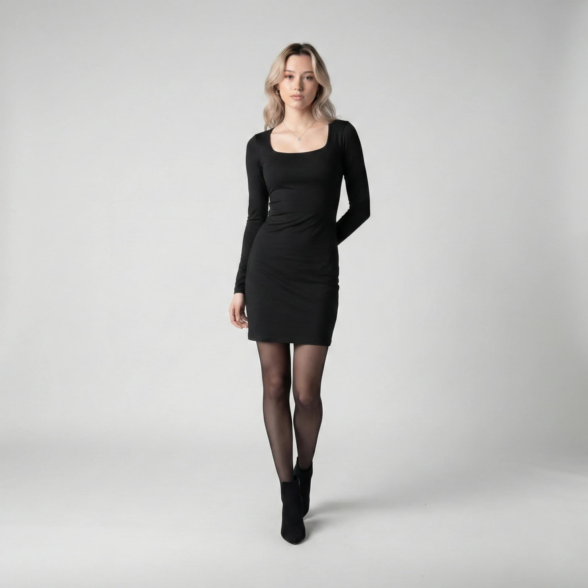
- Deep neutrals like navy or charcoal
Lighting that looks premium can quietly distort reality.
Over-Editing and Preset Dependency
Aggressive color grading and presets often standardize mood at the expense of accuracy.
Common issues include:
- Boosted saturation to make colors “pop”
- Warm overlays applied uniformly across products
- Contrast adjustments that deepen or flatten tones
These edits may look cohesive in a grid, but they increase return risk at the individual product level.
Inconsistent Color Treatment Across Images
When multiple images of the same product show slightly different colors, shoppers assume inconsistency.
This includes:
- Primary images that differ from detail shots
- On-model images that differ from flat lays
- Lifestyle images that shift tone compared to studio shots
Inconsistency creates doubt even if one of the images is technically correct.
Why Color Accuracy Reduces Returns More Than Copy Ever Will
Product descriptions can clarify fit, fabric, and care. They cannot correct visual disappointment.
When shoppers open a package and the color feels wrong:
- No amount of description justifies the mismatch
- Emotional response overrides rationalization
- Returns feel justified and necessary
Accurate color sets expectations that survive delivery.
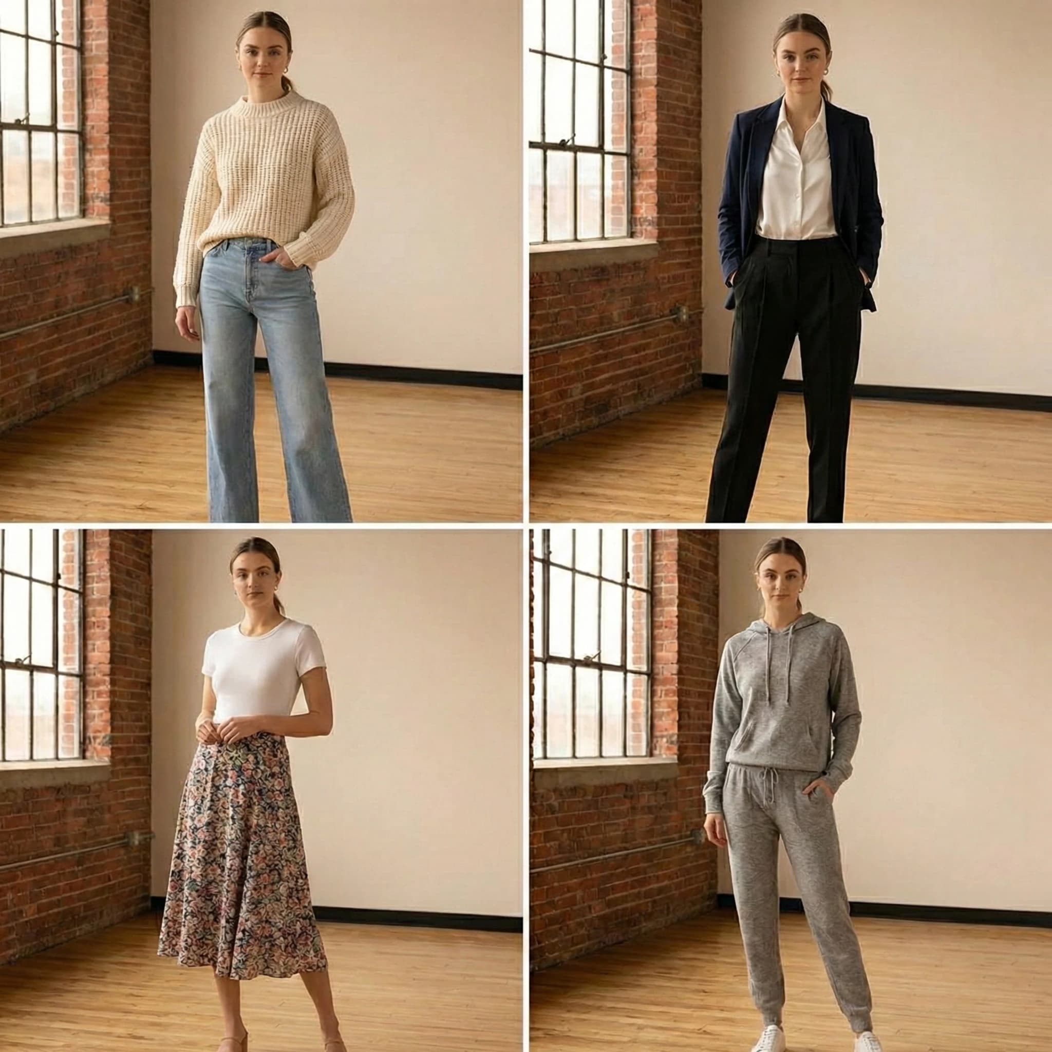
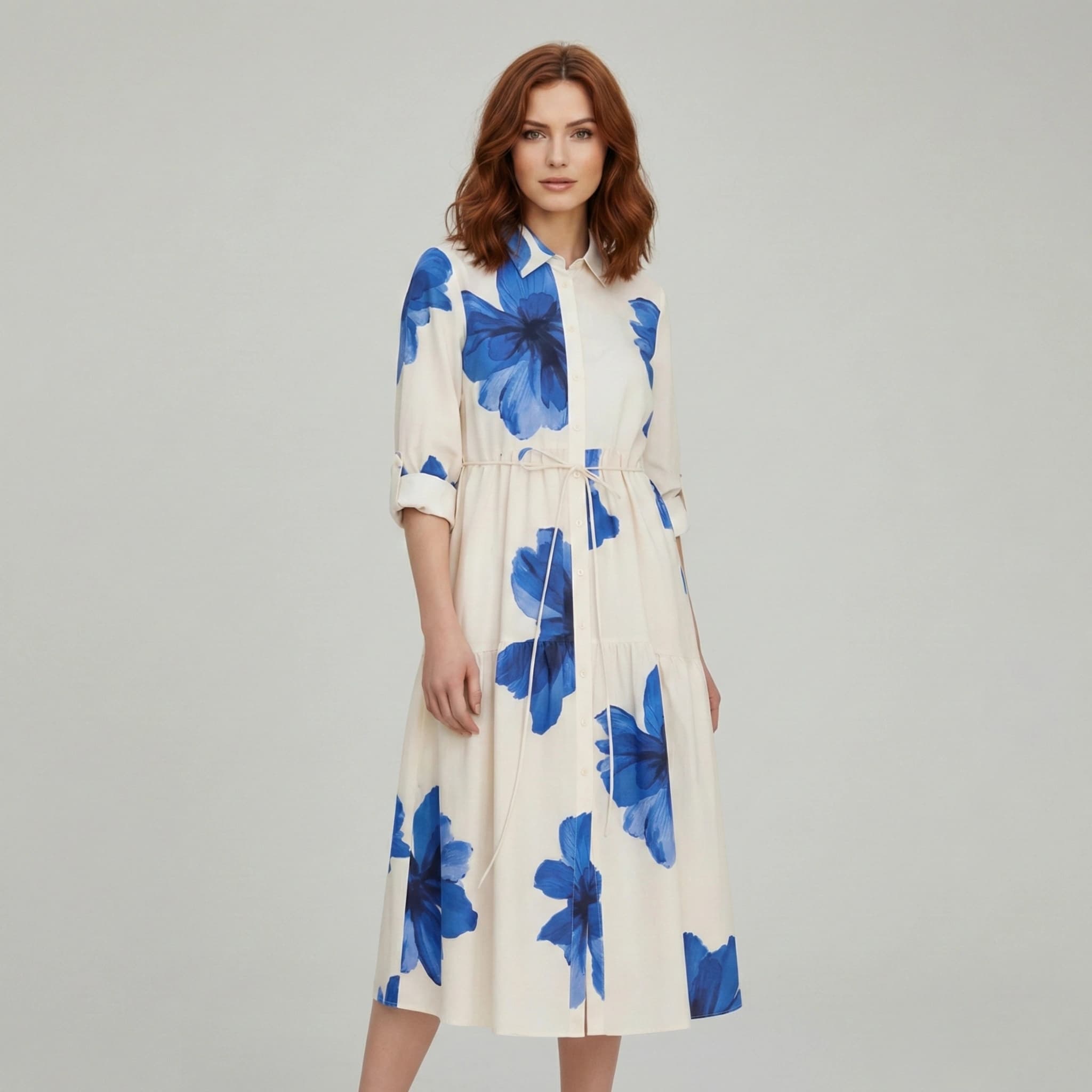
Categories Where Color Accuracy Matters Most
While color matters for all fashion products, return sensitivity is highest in:
- Dresses and occasion wear
- Knitwear and soft fabrics
- Light-colored garments
- Multi-color or patterned items
In these categories, even minor inaccuracies amplify dissatisfaction.
How High-Performing Brands Handle Color Representation
Brands with low color-related return rates typically follow consistent principles.
They:
- Use neutral, controlled lighting environments
- Minimize creative color grading on product images
- Treat color accuracy as a performance metric, not a visual preference
- Maintain consistent color handling across collections
Their images may look less dramatic, but they perform better over time.
How to Audit Color Accuracy on Your Product Pages
To evaluate your own risk, ask:
- Do all images of the same product show the same color?
- Would the product look similar in neutral indoor lighting?
- Are edits enhancing realism or mood?
- Do color variants have dedicated images or only swatches?
If any of these answers raise uncertainty, returns are likely being driven by color mismatch.
The Relationship Between Color Accuracy and Brand Trust
Color issues do not just affect single transactions. They affect repeat behavior.
Shoppers who experience color mismatch:
- Are less likely to repurchase
- Are more cautious with future orders
- Share negative experiences privately, not publicly
Trust erosion rarely shows up in reviews, but it compounds silently.
Final Takeaway
Color accuracy is not a creative constraint. It is a commercial necessity.
Fashion brands that prioritize accurate color representation:
- Reduce return rates
- Strengthen buyer trust
- Create more predictable performance at scale
In fashion ecommerce, the most profitable color is the one that looks the same in real life as it does on the screen.
Transform your fashion photography!!
Start Creating with AIRead Next
10 Image Optimization Hacks That Reduce Returns for Fashion Ecommerce Sellers
Returns are one of the biggest profit killers in fashion ecommerce. In most cases, customers do not ...
Why Shopify Theme Cropping Decisions Hurt Mobile Conversion
Most Shopify fashion founders evaluate their product images on desktop. Most shoppers evaluate them...
How Fashion Brands Can Use AI Models to Reduce Photoshoot Costs and Scale Faster
Fashion brands operate in a high-pressure environment where speed, cost efficiency, and visual quali...