Why Shopify Theme Cropping Decisions Hurt Mobile Conversion
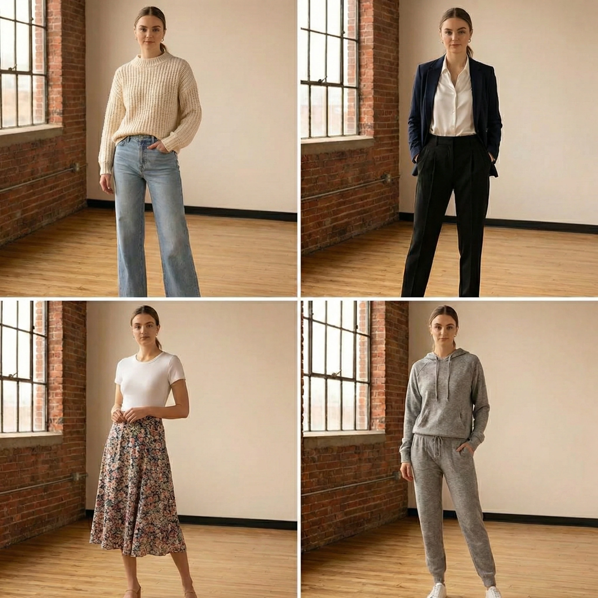
Most Shopify fashion founders evaluate their product images on desktop.
Most shoppers evaluate them on mobile.
This mismatch creates a silent conversion leak that has nothing to do with lighting, styling, or photography quality. It is often caused by theme-level cropping behavior.
In Shopify, image cropping is not just a design setting. It directly shapes fit perception, silhouette clarity, and trust formation within the first three seconds of page load.
On mobile, those three seconds determine whether a shopper continues scrolling or exits.
How Shopify Themes Handle Image Cropping
Most Shopify 2.0 themes control image display through:
- Fixed aspect ratio containers
- Automatic center cropping
- Grid-based thumbnail scaling
- Responsive resizing rules
Common defaults include:
- 1:1 square cropping
- 4:5 portrait ratio
- 3:4 adaptive portrait
- Hard-cropped collection thumbnails
The problem is not the ratio itself.
The problem is that product photography is often shot in a different ratio than the theme enforces.
When a 4:5 editorial image is forced into a square crop on mobile, key visual signals disappear.
Why Cropping Errors Are Worse on Mobile
Mobile constraints amplify cropping problems for three reasons.
1. Limited Viewport Height
On mobile, the first image usually occupies the majority of the screen.
If the crop:
- Cuts off footwear
- Removes shoulder structure
- Trims fabric length
- Hides sleeve detail
The shopper forms an incomplete product understanding.
Desktop users may scroll and recover context. Mobile users often do not.
2. Faster Decision Cycles
Mobile shoppers move quickly.
If the hero image does not immediately communicate:
- Full silhouette
- Fabric weight
- Fit proportion
- Color accuracy
They exit before interacting with the gallery.
This reduces:
- Gallery progression rate
- Variant engagement
- Add to Cart rate
The image never gets a second chance.
3. Thumb-Driven Interaction
Mobile galleries rely on swipe gestures.
If cropping reduces visual clarity, users are less motivated to swipe.
Low swipe depth correlates strongly with lower conversion in fashion categories where fit confidence drives purchase.
Where Cropping Commonly Breaks in Shopify
Collection Grids
Many Shopify themes auto-crop collection thumbnails to uniform squares.
If your product photography varies in vertical framing, grid consistency forces cropping that may:
- Remove garment length
- Distort proportions
- Hide asymmetrical design elements
This affects clickthrough rate before a shopper ever reaches the PDP.
Measure:
- Collection clickthrough rate by product category
- Grid engagement by device type
If CTR is lower on mobile for long-silhouette categories such as dresses or coats, cropping is a likely contributor.
Product Page Hero Images
On PDPs, themes often:
- Lock image height
- Center-crop images
- Resize dynamically based on viewport width
If your subject is not centered precisely in the original photography, Shopify will crop unpredictably.
This is especially damaging for:
- Off-center model poses
- Movement shots
- Styled compositions
In fashion ecommerce, clarity beats artistry.
If artistic framing compromises garment visibility in the crop, conversion suffers.
Variant Switching
Some themes reload the gallery or reapply cropping when a variant is selected.
This can:
- Shift the focal point
- Reposition the garment
- Change visible proportions
Visual instability during variant switching reduces confidence.
If the shopper perceives the garment shape changing between colors, trust drops.
The Hidden Impact on Return Rate
Cropping does not only affect conversion.
It also affects expectation alignment.
If the crop:
- Hides garment length
- Minimizes sleeve volume
- Conceals texture thickness
- Compresses drape
The delivered product may feel different from what was visually implied.
This increases:
- Size-related returns
- Fit-related dissatisfaction
- Texture-related complaints
The cropping decision is part of expectation management.
How to Audit Cropping Risk in Your Shopify Store
Step 1: Review Mobile First
Do not audit on desktop.
Open your PDPs on:
- iPhone standard viewport
- Smaller Android viewport
Evaluate:
- Is the full garment visible?
- Are proportions accurate?
- Is any key design detail missing?
Step 2: Compare Collection vs PDP Framing
Collection thumbnails must:
- Match the core silhouette shown on PDP
- Avoid showing a cropped region that feels different from the hero image
If the grid shows a waist-up crop but the PDP hero shows full length, expectation disconnect occurs.
Step 3: Test Across Aspect Ratio Settings
Many Shopify themes allow aspect ratio adjustments in theme settings.
Test:
- Square vs portrait
- Fixed vs adaptive height
- Image fill vs image fit
Measure changes in:
- Collection CTR
- Gallery progression
- Mobile conversion rate
Small ratio adjustments can produce measurable lift.
Strategic Solutions
1. Shoot for the Theme, Not for Instagram
If your theme enforces 4:5 portrait, shoot products framed with safe margins that survive cropping.
Include negative space around garments to protect against auto-crop trimming.
2. Standardize Framing Across SKUs
Inconsistent framing magnifies cropping distortion.
If one product is centered tightly and another loosely, auto-cropping affects them differently.
Standardize:
- Model distance from camera
- Garment vertical positioning
- Headroom and footroom margins
Consistency reduces distortion risk.
3. Use Separate Assets for Collection and PDP When Necessary
In some cases, a tightly framed collection thumbnail performs better for CTR, while a full-length PDP image performs better for conversion.
Shopify allows assigning different featured images for collections.
Use this intentionally.
4. Validate After Theme Changes
Theme updates can alter image rendering rules.
After:
- Installing a new theme
- Updating theme versions
- Adjusting section layouts
Re-test cropping behavior on mobile.
Visual regression is common during redesigns.
Final Takeaway
In Shopify fashion stores, cropping is not a cosmetic setting. It is a conversion variable.
Mobile shoppers decide quickly. If the first image does not clearly communicate silhouette, proportion, and detail because of theme-level cropping, confidence drops immediately.
Before investing in new photography, audit how your existing images are being rendered.
In mobile-first fashion ecommerce, the frame is the product. If the frame is wrong, the revenue impact follows.
Transform your fashion photography!!
Start Creating with AIRead Next

How to Track Product Image Interaction Data Inside Shopify
Most Shopify fashion brands evaluate product imagery using one metric: conversion rate. That is ins...
Accuracy vs Speed: The Core Tradeoff in AI Fashion Imagery
AI fashion imagery promises speed. Faster launches, quicker iteration, lower production friction. Fo...
Color Accuracy in Fashion Product Photos and Its Impact on Returns
Color accuracy is one of the most underestimated factors in fashion ecommerce performance. Many bran...